childcare_costs <- read_csv('https://raw.githubusercontent.com/rfordatascience/tidytuesday/master/data/2023/2023-05-09/childcare_costs.csv')
counties <- read_csv('https://raw.githubusercontent.com/rfordatascience/tidytuesday/master/data/2023/2023-05-09/counties.csv')Lab 6: Childcare Costs in California
Part 1: GitHub Workflow
Step 1: Make a GitHub Repoistory
Be sure to set up a GitHub repository and then use Version Control to set up your Lab 6 R Project so it is connected. Then download this week’s lab file into the folder and include the following:
Step 2: Making a Small Change
Now, find the lab-6-student.qmd file in the “Files” tab in the lower right hand corner. Click on this file to open it.
At the top of the document (in the YAML) there is an author line that says "Your name here!". Change this to be your name and save your file either by clicking on the blue floppy disk or with a shortcut (command / control + s).
Step 3: Pushing Your Lab to GitHub
Now for our last step, we need to commit the files to our repo.
- Click the “Git” tab in upper right pane
- Check the “Staged” box for the
lab-6-student.qmdfile - Click “Commit”
- In the box that opens, type a message in “Commit message”, such as “Added my name”.
- Click “Commit”.
- Click the green “Push” button to send your local changes to GitHub.
RStudio will display something like:
>>> /usr/bin/git push origin HEAD:refs/heads/main
To https://github.com/atheobold/introduction-to-quarto-allison-theobold.git
   3a2171f..6d58539  HEAD -> main
Step 4: Let’s get started tidying some data!
Part 2: Some Words of Advice
Set chunk options carefully.
Make sure you don’t print out more output than you need.
Make sure you don’t assign more objects than necessary—avoid “object junk” in your environment.
Make your code readable and nicely formatted.
Think through your desired result before writing any code.
Part 3: Exploring Childcare Costs
In this lab we’re going look at the median weekly cost of childcare in California. A detailed description of the data can be found here.
The data come to us from TidyTuesday.
0. Load the appropriate libraries and the data.
1. Briefly describe the dataset (~ 4 sentences). What information does it contain?
California Childcare Costs
Let’s start by focusing only on California.
2. Create a ca_childcare dataset of childcare costs in California, containing (1) county information and (2) just the year and childcare cost variable information from the childcare_costs dataset.
Hint: There are 58 counties in CA and 11 years in the dataset. Therefore, your new dataset should have 53 x 11 = 638 observations. The final data set should have study year, median household income expressed in 2018 dollars, all the variables associated with full-time median price charged for Center-based Care, and California county names
3. Using a function from the forcats package, complete the code below to create a new variable where each county is categorized into one of the 10 Census regions in California. Use the Region description (from the plot), not the Region number. An example region has been started for you.
Hint: This is probably a good place to use ChatGPT to reduce on tedious work. But you do need to know how to prompt ChatGPT to make it useful!
Tip
I have provided you with code that eliminates the word “County” from each of the county names in your ca_childcare dataset. You should keep this line of code and pipe into the rest of your data manipulations.
You will learn about the str_remove() function from the stringr package next week!
ca_childcare <- ca_childcare |>
  mutate(county_name = str_remove(county_name, " County")) |>
  ...
4. Let’s consider the median household income of each region, and how that income has changed over time. Create a table with ten rows, one for each region, and two columns, one for 2008 and one for 2018. The cells should contain the median of the median household income (expressed in 2018 dollars) of the region and the study_year. Arrange the rows by 2018 values.
Tip
This will require transforming your data! Sketch out what you want the data to look like before you begin to code. You should be starting with your California dataset that contains the regions!
5. Which California region had the lowest median full-time median weekly price for center-based childcare for infants in 2018? Does this region correspond to the region with the lowest median income in 2018 that you found in Q4?
Warning
The code should give me the EXACT answer. This means having the code output the exact row(s) and variable(s) necessary for providing the solution. Consider using one of the slice functions.
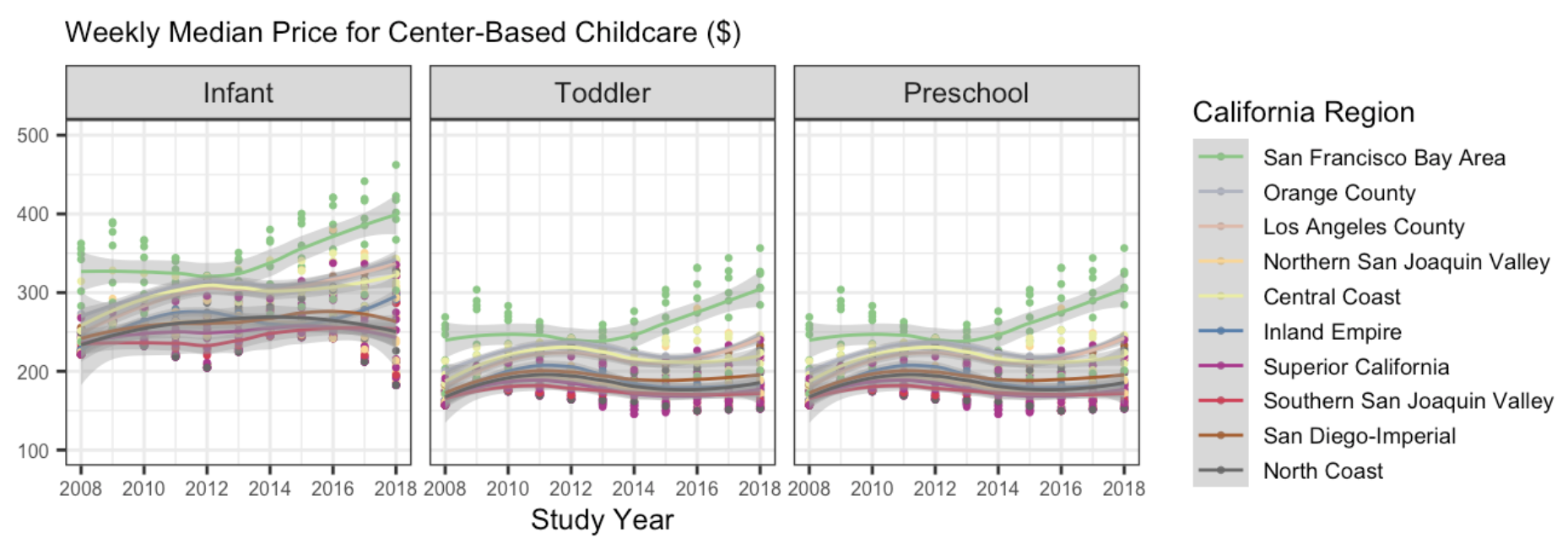
6. The following plot shows, for all ten regions, the change over time of the full-time median price for center-based childcare for infants, toddlers, and preschoolers. Recreate the plot. You do not have to replicate the exact colors or theme, but your plot should have the same content, including the order of the facets and legend, reader-friendly labels, axes breaks, and a loess smoother.
Tip
This will require transforming your data! Sketch out what you want the data to look like before you begin to code. You should be starting with your California dataset that contains the regions.
You will also be required to use functions from forcats to change the labels and the ordering of your factor levels.
Remember to avoid “object junk” in your environment!
There is no Challenge this week!
Please take this time to try your best to recreate the plot I provided in Question 6!
- Can you match my colors?
- Can you get the legend in the same order?
- Can you get the facet names to match and be in the same order?
Could you even make the plot better? Could you add dollar signs to the y-axis labels? I might suggest you look into the scales package.